Scatter Plots are among the most used types of graphs in statistics and science.
But knowing what type of chart to use to compare data and how to format it to inspire your audience can be tricky - and it can make or break your presentation!
You don't need to sacrifice a virgin on hallowed ground under a blood moon to get it right, though.
If you want to engage your audience and produce well-crafted Scatter Plots that have the potential to change the world, there are only a few simple data visualisation best practices that you need to follow.
And they are all here!
Disclosure: we may earn an affiliate commission for purchases you make when using the links to products on this page. As an Amazon Affiliate we earn from qualifying purchases.
In this guide on how to choose the right chart for your data, I’ll explain about the different types of Scatter Plot you’ll use.
Then I’ll show you which data goes on which axis (pay attention - this is more important than you think!).
I’ll show you the different types of Scatter Plot to use, and how to choose the right chart for your data.
We’ll move on to how to style your Scatter Plots and review them with a critical eye to decide what should go on your graph, and – more importantly – what you should take off.
FREE DataViz Flowchart

Master the Fundamentals of Data Visualisation
Ultra-Hi-Definition PDF
By the time you’ve read this dataviz guide, you’ll know more about plotting charts than pretty much everyone around you!
Your DataViz Jump-Station
This post is part of a series of articles about the most used types of graphs in statistics for presenting data.
You can use the following jump-station to choose the content you're looking for (and there will be another jump-station at the bottom of this post):
DataViz Jump-Station
This post is part of a series on the most used graphs in statistics.
For more detail, choose from the options below:
DataViz:
How to Choose The Right Chart for Your Data
Scatter Plot
What is a Scatter Plot?
A Scatter Plot is a type of mathematical diagram that uses a pair of axes to display values of two (or more) set of numerical data to show they are related to each other. The points (usually dots or crosses) in a Scatter Plot not only show the values of individual data points, but also patterns or trends when all data points are taken as a whole.
Scatter Plots - How to Choose the Right Chart for Your Data @chi2innovations #datavisualization #charts
What does a Scatter Plot show?
A Scatter Plot shows the relationship between a pair of numerical variables. Before plotting your data, you should identify the variable with your feature of interest and plot this on the y-axis.
VIDEO COURSE
Statistics:
The Big Picture
Free to try - no need to buy or register!
Types of Scatter Plot
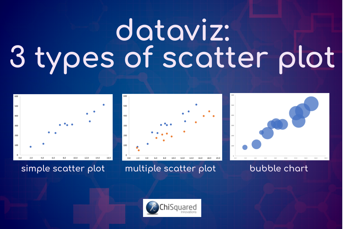
There are 3 main types of Scatter Plot you’ll come across in statistics:
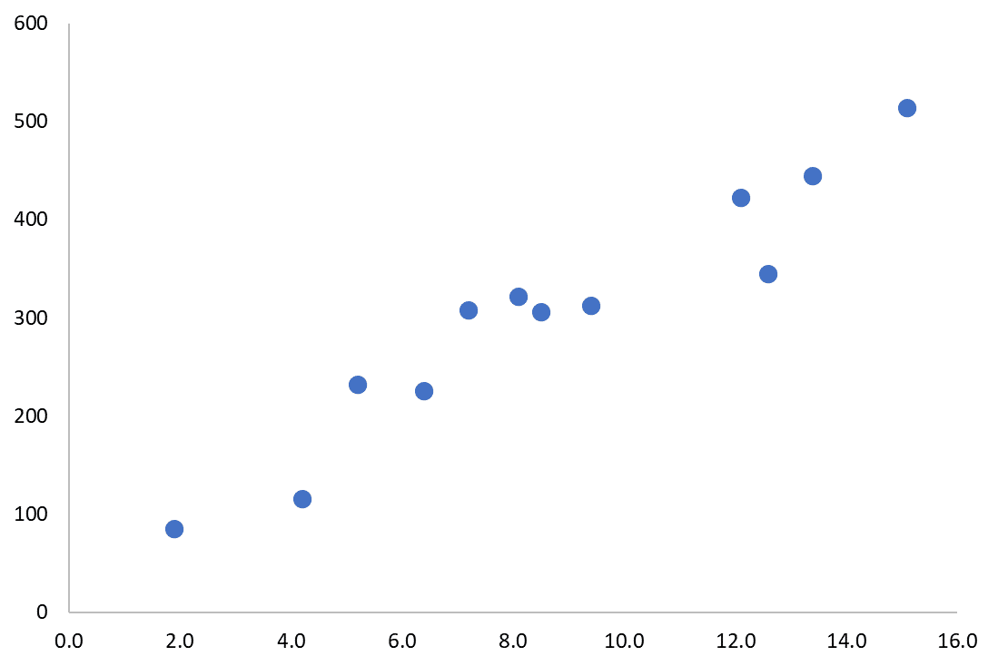
Simple Scatter Plot (or just Scatter Plot).
This is the simplest type of Scatter Plot, in which a pair of numerical variables are plotted against each other as discrete points on a chart. Scatter plots are easy to create and show the relationship of one variable to another – they are ideal for many types of scientific data.
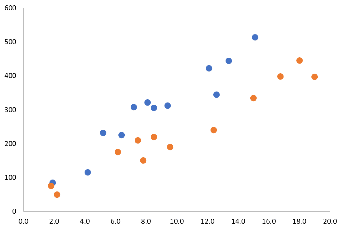
Multiple Scatter Plot.
A Multiple Scatter Plot is the same as a Simple Scatter Plot, but with more than one numerical variable plotted on the y-axis. A Multiple Scatter Plot allows the direct comparison between multiple numerical variables over a single x-axis variable. Multiple Scatter Plot can handle many data points. But quickly become confusing when more than 2 or 3 y-axis variables are plotted (unless they occupy distinct spaces on the axes).
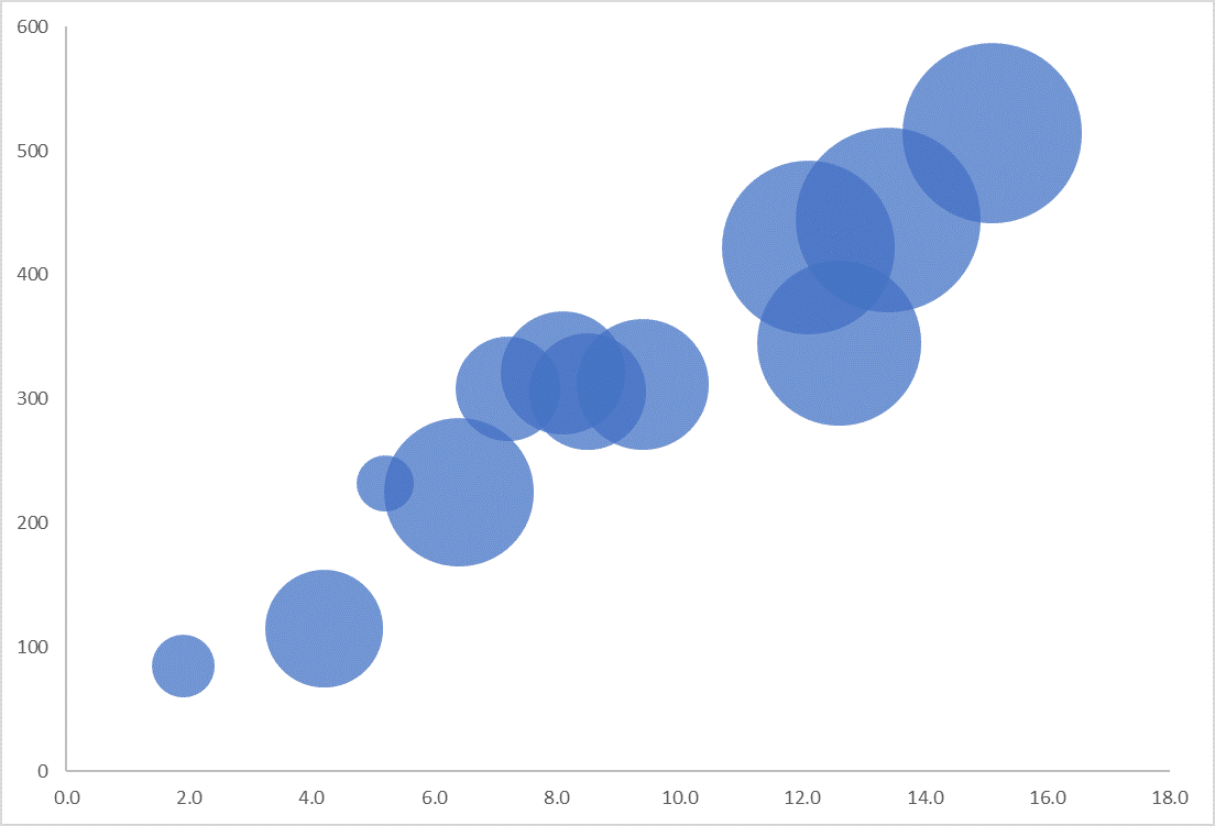
Bubble Chart.
When you have 3 numerical variables that should be plotted on three independent axes (x-, y- and z-axes), it can become very difficult to visualise. A Bubble Chart makes this possible. You can think of a Bubble Chart as ‘x versus y, scaled by z’. Although Bubble Charts can be very visually appealing, they can be very difficult to read, especially for the third (z-axis) numerical variable.
Scatter Plot Example
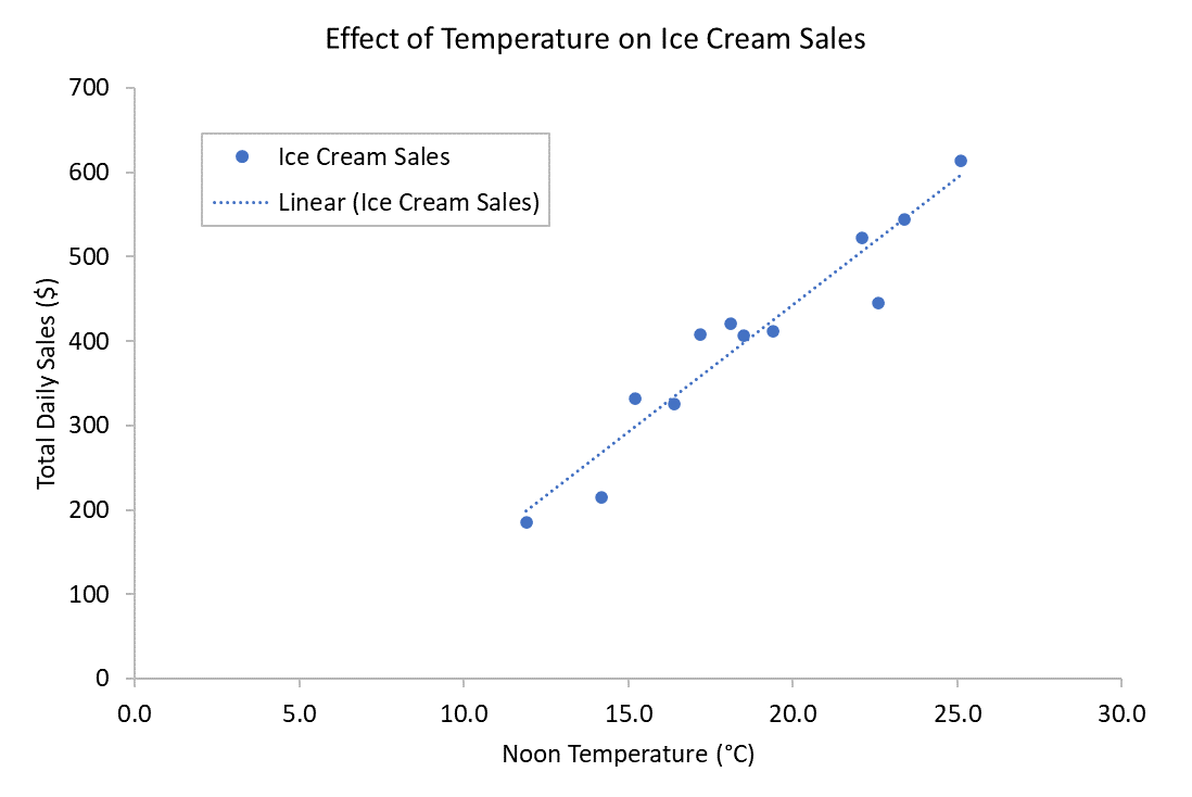
If you’re an Italian ice cream salesman and you wanted to know if temperature had an effect on your ice cream sales, you could plot the daily noon temperature (x-axis) against your total daily sales of ice cream (y-axis) on a Scatter Plot. Add in a trend line and you would have a Scatter Plot that looks like this:
Scatter Plot Example – Interpretation
When you need to make an interpretation of a Scatter Plot, as with other chart types you should start by understanding the Title, the axes and their units.
Then look at each series in turn (they will be colour-coded if there is more than one series).
Now compare the data in each group.
Applying these to our Scatter Plot example, we can clearly see that as temperatures increase, more ice creams are sold. The trend line is linear, so knowing what tomorrow’s weather will be should allow us to predict how many ice creams we will need to make, or whether we should put a large pot of coffee on instead!
FREE DataViz Flowchart

Master the Fundamentals of Data Visualisation
Ultra-Hi-Definition PDF
When To Use Scatter Plots
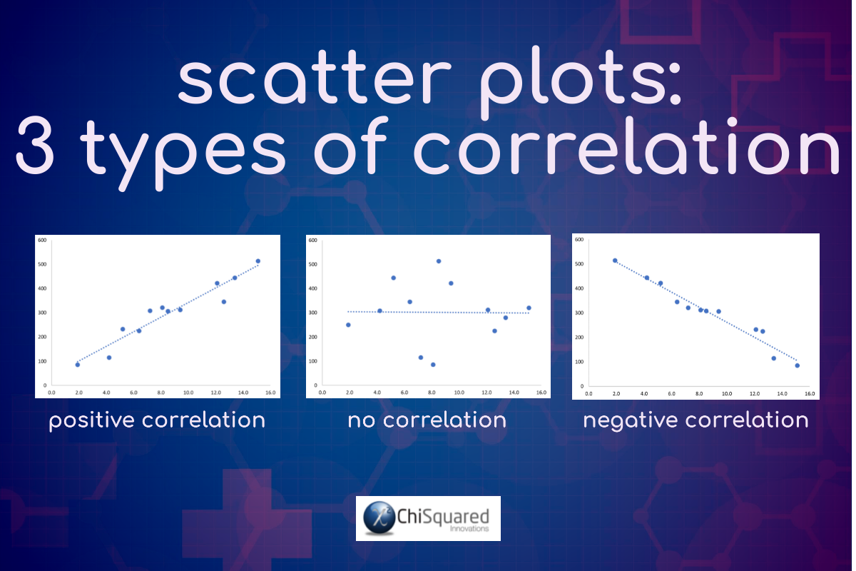
Scatter Plots are used when you’re looking for relationships between numerical variables, and are often accompanied by a trend line to help show correlations.
When the trend line rises from bottom left to top right, there is a positive correlation between the variables (this is not necessarily significant – you need a statistics test to confirm this), i.e. when the predictor variable (x-axis) increases, your feature of interest (y-axis) increases too.
When the trend line falls from top left to bottom right, there is a negative correlation – as your predictor variable increases, your feature of interest decreases.
When the trend line is (mostly) horizontal or vertical, there is no relationship between the variables.
Scatter Plots are particularly good for spotting outliers in your data set.
When To Avoid Scatter Plots
Scatter Plots work well when you have a lot of data points and a correlation, so avoid them when you have a small data set and when there is no clear relationship between the variables.
Scatter Plots - Best Practice
Scatter Plots – Summary
It's easy to use Scatter Plots correctly, format them well and make your entire presentation pop - as long as you follow the data visualisation best practices in this post.
And if you do, your chart has the potential to inspire those around you to change the world, and that's precisely what you're looking for.
Hopefully, you now have a much better understanding of Scatter Plots, when to use them, what type of chart to use to compare data, and how to present your chart to inspire those around you - and perhaps bag that next promotion too!
Pin it for later
Loved it?
Pin it to your favourite board!
Your DataViz Jump-Station
Looking for your next step?
You can use the following jump-station to choose the content you're looking for:
DataViz Jump-Station
This post is part of a series on the most used graphs in statistics.
For more detail, choose from the options below:
DataViz:
How to Choose The Right Chart for Your Data


