Line Charts are among the most used types of graphs in statistics, and there are different types of them.
Knowing what type of chart to use to compare data can be difficult - and it can ruin your study if you're not careful!
You don't need to be a master in the dark arts to get it right, though.
To create well-crafted charts that inspire others to change the world, there are only a few simple data visualisation best practices that you need to follow.
And they are all here!
Disclosure: we may earn an affiliate commission for purchases you make when using the links to products on this page. As an Amazon Affiliate we earn from qualifying purchases.
In this guide on how to choose the right chart for your data, I’ll explain about the different types of Line Chart you’ll use.
Then I’ll show you which data goes on which axis.
I’ll show you the different types of Line Charts to use, and how to choose the right chart for your data.
We’ll move on to how to style your Line Charts and review them with a critical eye to decide what should go on your graph, and – more importantly – what you should take off.
FREE DataViz Flowchart
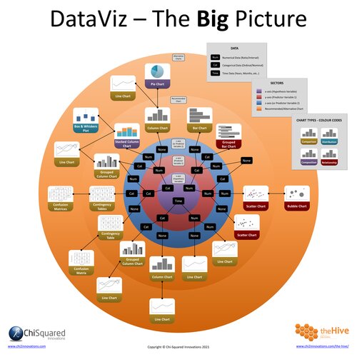
Master the Fundamentals of Data Visualisation
Ultra-Hi-Definition PDF
By the time you’ve read this dataviz guide, you’ll know more about plotting charts than pretty much everyone around you!
Your DataViz Jump-Station
This post is part of a series of articles about the most used types of graphs in statistics for presenting data.
You can use the following jump-station to choose the content you're looking for (and there will be another jump-station at the bottom of this post):
DataViz Jump-Station
This post is part of a series on the most used graphs in statistics.
For more detail, choose from the options below:
DataViz:
How to Choose The Right Chart for Your Data
Line Chart
What is a Line Chart?
A Line Chart is a graph that uses lines to connect individual data points called 'markers' with straight (or curved) lines.
Different types of Line Chart exist, and for different purposes. We'll delve deeper into this below.
Line Charts - How to Choose the Right Chart for Your Data @chi2innovations #datavisualization #charts
What does a Line Chart show?
A Line Chart is a graph that uses lines to connect individual data points, and is used most often to show how a numerical variable changes over time, but not always.
VIDEO COURSE
Statistics:
The Big Picture
Free to try - no need to buy or register!
Types of Line Chart
There are 3 basic types of Line Chart you’ll come across in statistics:
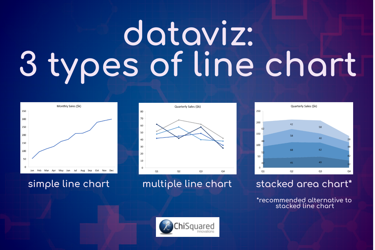
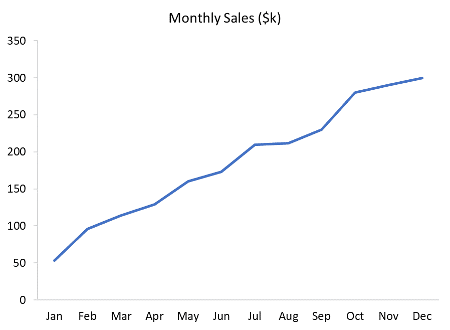
Simple Line Chart (or just Line Chart).
This simplest type of Line Chart is used to show how a single numerical variable (y-axis) changes over time or over categories (x-axis). Simple Line Charts are easy to read, simple and versatile, and can handle more categories than a Column Chart before becoming cluttered and confusing.
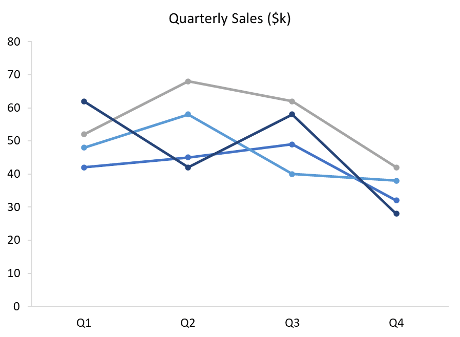
Multiple Line Chart.
A Multiple Line Chart is the same as a Simple Line Chart, but with more than one numerical variable plotted on the y-axis. A Multiple Line Chart allows the direct comparison between multiple numerical variables over time or over categories. Multiple Line Charts can handle many more data points and categories than a Column Chart before becoming cluttered.
Stacked Line Chart.
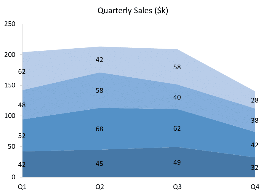
A Stacked Line Chart is equivalent to a Stacked Column Chart, where data are stacked on top of each other to show part-to-whole comparisons. With Stacked Line Charts it is easy to compare the total column heights, but can be difficult to compare the sizes of each component within each column. Also, Stacked Line Charts can be confusing for the viewer to interpret correctly, and it is better to use a Stacked Area Chart as an alternative, like this one:
Line Chart Example
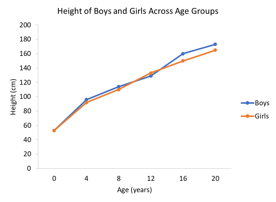
In the Column Chart example, we plotted the height of boys and girls across various age groups to show how they differ. Well, instead of a Column Chart, you could have used a Line Chart, like this:
Line Chart Example – Interpretation
When you need to make an interpretation of a Line Chart, you should start by understanding the Title and the axes – including their units.
Then look at each series in turn.
Now take a look at the data in each group.
Applying these to our Line Chart example, we can infer that as boys and girls get older, they grow taller. This may sound obvious (and it is), but we’re not interested in ‘obvious’ – we’re only concerned with data!
Looking at the finer details, boys and girls are the same height at birth, but in all other age groups boys are taller than girls, except at 12 years old, when the reverse is true. This is an interesting detail to point out to your audience, and may well be the starting point for new research!
It is useful to note how sometimes a switch in graph types can make it easier to spot fine detail.
We followed this example in plotting a Column Chart, but it wasn’t obvious that girls were taller than boys in the 12-year-old group. It is much easier to spot that here with the Line Chart.
There is also something we missed when looking at the Column Chart that is easier to see here – boys are only slightly taller than girls in the younger age groups, but are much taller in the higher age groups. A Column Chart of the difference in heights at each age group would be a great way to display this to your audience!
Line Chart vs Bar Chart
So, if you can plot the same data on both a Line Chart and on a Column Chart, when should you use a Line Chart vs Bar Chart (or, more accurately, a Column Chart)?
Well, the difference is in the x-axis variable. If your x-axis variable is continuous (i.e. you can interpolate between the values), then you should use a Line Chart.
So, for example, if the categories on the x-axis are Age, as in the Line Chart and Column Chart above, we can safely interpolate between values (e.g. halfway between 8 and 12 years is 10 years). This makes sense, and using a Line Chart would be more appropriate than a Column Chart.
On the other hand, when your x-axis categories are discontinuous (i.e. you cannot interpolate between values), then you should use a Column Chart.
If the categories on the x-axis were T-shirt sizes, we cannot interpolate; halfway between Medium and Large is not “Medium-and-a-half” – that makes no sense. In this case, then, you should not use a Line Chart, because that suggests that interpolation is fine, which it isn’t. Here, you should use a Column Chart.
FREE DataViz Flowchart

Master the Fundamentals of Data Visualisation
Ultra-Hi-Definition PDF
When To Use Line Charts
You use Line Charts when showing trend-based data visualisations over time or over categories. As such, the feature of interest is always numerical and is plotted on the y-axis. The x-axis may be categorical or time-based.
Line Charts are preferable to Column Charts when the number of categories is large, and/or when there are multiple numerical variables to show.
When To Avoid Line Charts
Too many variables can make your Line Charts cluttered and confusing. If you have too many variables, it’s time to consider more than one chart to tell your story.
Line Charts - Best Practice
Whilst Line Charts are some of the most used types of graphs in statistics, it's easy to get the wrong one, present it poorly and put your boss to sleep.
And that won't be good for your next promotion push.
Hopefully, you now have a much better understanding of Line Charts, when to use them, what type of chart to use to compare data, and how to present your chart to inspire those around you to change the world for the better.
Pin it for later
Loved it?
Pin it to your favourite board!
Your DataViz Jump-Station
Looking for your next step?
You can use the following jump-station to choose the content you're looking for:
DataViz Jump-Station
This post is part of a series on the most used graphs in statistics.
For more detail, choose from the options below:
DataViz:
How to Choose The Right Chart for Your Data


