Pie Charts are probably the most used - and misused - types of graphs in statistics, and they come in all shapes and sizes.
Knowing what type of chart to use to compare data and how to format it well can be tricky. And it can make or break your study - especially when your audience knows how Pie Charts can be used to deceive!
Although in most cases Pie Charts are not recommended, there are a few (small) instances when you can use them (with great care!)
In this post you'll find out under precisely which conditions you can use Pie Charts - and when you shouldn't.
Disclosure: we may earn an affiliate commission for purchases you make when using the links to products on this page. As an Amazon Affiliate we earn from qualifying purchases.
In this guide on how to choose the right chart for your data, I’ll explain about the different types of Pie Chart you’ll come across.
Then I’ll show you what types of data you can use.
I’ll show you the different types of Pie Charts to use, and which ones not to.
We’ll move on to how to style your Pie Charts and review them with a critical eye to decide what should go on your graph, and – more importantly – what you should take off.
FREE DataViz Flowchart
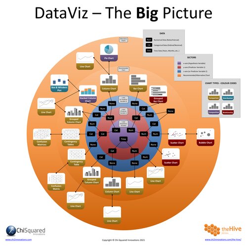
Master the Fundamentals of Data Visualisation
Ultra-Hi-Definition PDF
By the time you’ve read this dataviz guide, you’ll know more about plotting charts than pretty much everyone around you!
Your DataViz Jump-Station
This post is part of a series of articles about the most used types of graphs in statistics for presenting data.
You can use the following jump-station to choose the content you're looking for (and there will be another jump-station at the bottom of this post):
DataViz Jump-Station
This post is part of a series on the most used graphs in statistics.
For more detail, choose from the options below:
DataViz:
How to Choose The Right Chart for Your Data
Pie Chart
What is a Pie Chart?
A Pie Chart is a circular graph divided in segments that each represent a proportion of the whole.
Pie Charts - How to Choose the Right Chart for Your Data @chi2innovations #datavisualization #charts
What does a Pie Chart show?
Pie Charts are used to show how categories represent parts of a whole and are used to show the composition of a categorical variable, where the sum total of all segments sums to 100%.
VIDEO COURSE
Statistics:
The Big Picture
Free to try - no need to buy or register!
Types of Pie Chart
There are 4 main types of Pie Chart you’ll come across in statistics:
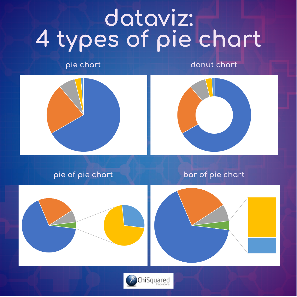
Pie Chart.
This is the standard Pie Chart, which should be simple, have few categories and be read at-a-glance (although most often they are not). Typically, it is difficult to compare relative sizes of the slices and they can become cluttered as more than about 4 categories are added.
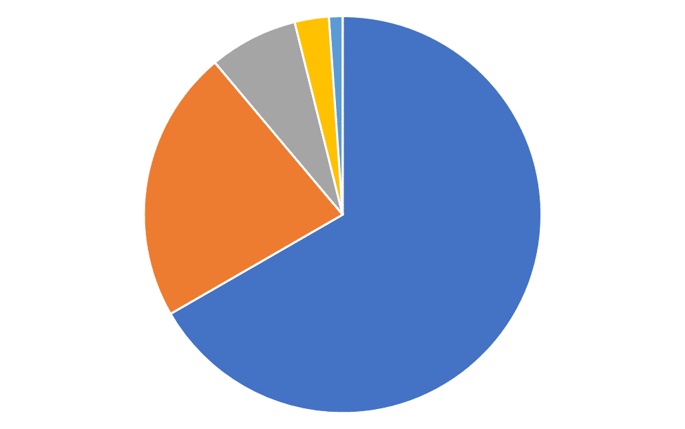
Donut Chart.
Donut Charts are identical to Pie Charts, but with a hole in the middle, and all the same pros and cons apply. Donut Charts are the cooler, younger brother of Pie Charts and you’ll find them on analytics dashboards and in business presentations. You won’t find them in statistics. Statistics is older and wiser.
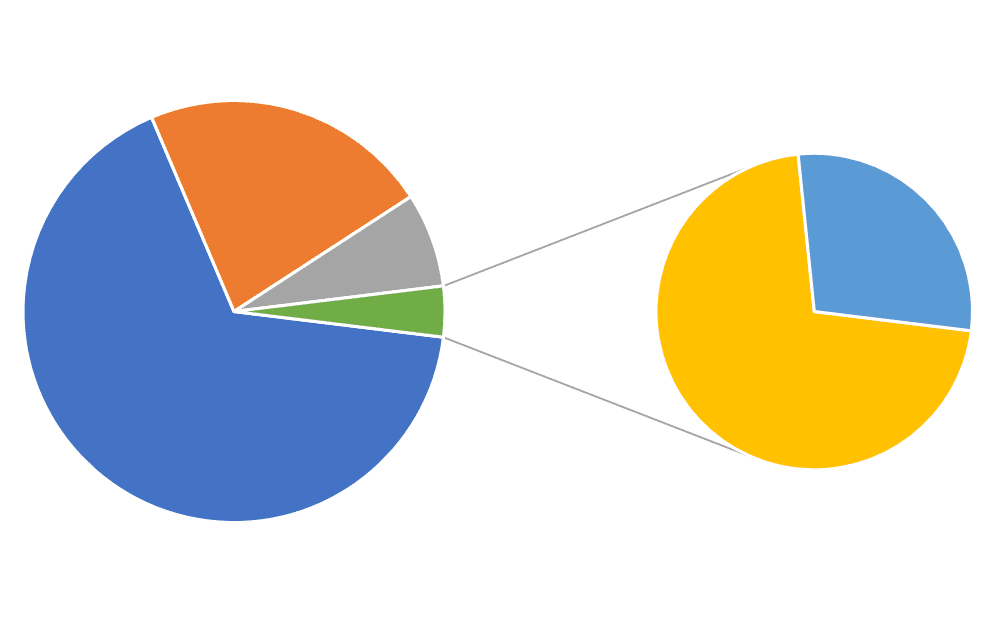
Pie of Pie Chart.
Pie of Pie Charts draw attention to the smaller parts of a Pie Chart by extracting them and creating a secondary Pie Chart to the side of the original. The big drawback here is that a large slice of the small Pie can look much bigger than slices of the original Pie, when obviously they aren’t. Don’t use these. Just use Column Charts.
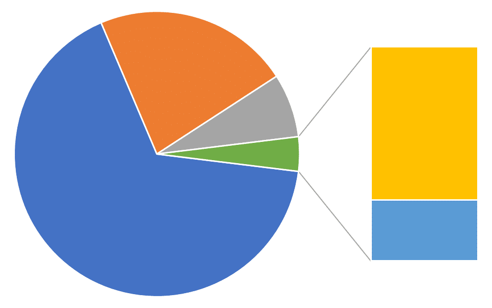
Bar of Pie Chart.
Bar of Pie Charts are precisely the same as Pie of Pie Charts, with the exception that the secondary data are plotted as a Column Chart rather than as a Pie Chart. This is a tiny improvement over the Pie of Pie Chart, but still – don’t use it. The Column Chart is King!
Pie Chart Example
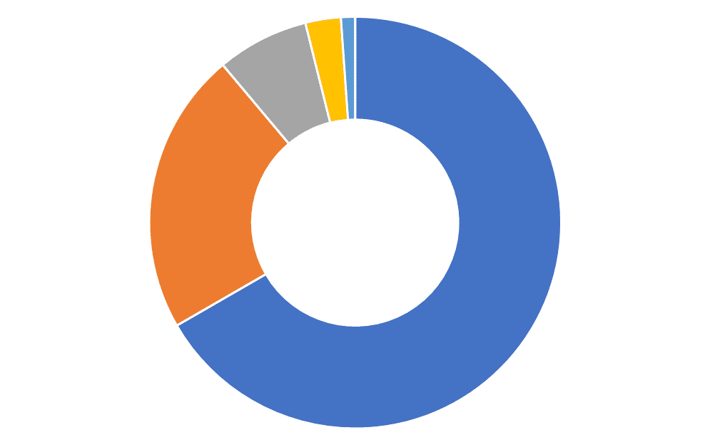
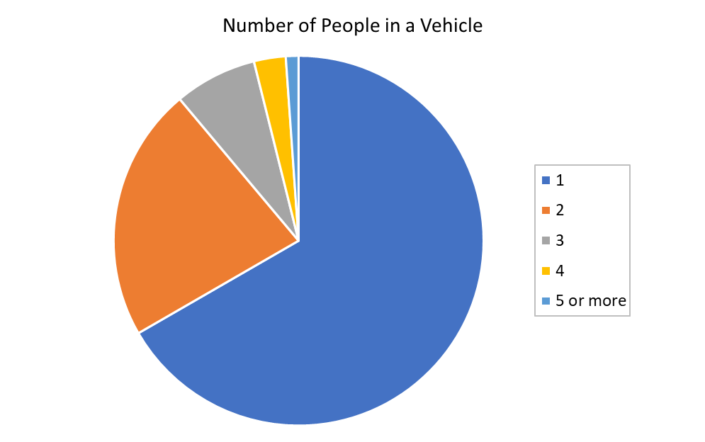
For example, if you conducted a survey to find out how many people travel to work together each day in a vehicle, you could plot these in a Pie Chart, like this:
Pie Chart Example – Interpretation
To interpret a Pie Chart, you compare the relative sizes of each category. Look for differences in the size of the slices.
So, let’s have a look at the Pie Chart example above.
Easy, isn’t it? After all, this is a really nice-looking Pie Chart, well-behaved with only a few categories and no weird stuff going on.
Actually, this is a much harder task than it looks!
It is easy to identify the largest category – it is the dark blue slice corresponding to a single traveller in the vehicle. What proportion of the whole is this? By eye it looks to be about 2/3 of the whole. If this is your guess, then you would be correct – the actual answer is 66.7%. So how many respondents said that they travelled to work alone? No idea – the chart can’t tell you! If you had plotted these data using a Column Chart, you could have read this off the y-axis, but since they are plotted as a Pie Chart you will never know…
What about the smallest category in light blue, corresponding to 5 travellers in the vehicle? What proportion of the whole is this? Er, it’s small, but just how small is difficult to tell. Perhaps 5% or maybe as small as 3%? Who knows?!?? (Actually, it’s 1.1%, but don’t tell anyone I told you).
And if we were to compare the proportions of the largest with the smallest slices, how many more vehicles travel to work with 5 people in them compared to just the driver? I haven’t got a clue!
Maybe a Column Chart would have been a better choice after all…
FREE DataViz Flowchart

Master the Fundamentals of Data Visualisation
Ultra-Hi-Definition PDF
When To Use Pie Charts
You can use Pie Charts when you want to compare the effect of one factor compared to the whole.
The Pie Chart is an alternative to a Column Chart; the x-axis is your categorical variable, and you can think of it as wrapping a linear axis round until it forms a circle – it is essentially a 100% Stacked Column Chart wrapped around into a circle. The height of the columns in the Column Chart then becomes the length of the arc in the Pie Chart.
As a general rule, if you’re unsure whether to use a Column Chart or a Pie Chart, most of the time you should choose the Column Chart.
You can use these 8 rules to using a Pie Chart. Pie Charts are OK when they:
- 1Are well-formatted. Don’t use 3D Pie Charts or Exploding Pie Charts. The simpler the better – eliminate anything that distracts from the meaning of the data.
- 2Show Nominal variables. Categorical variables that have an order (Ordinal) shouldn’t be plotted on a Pie Chart. Instead, plot them on a Column Chart or a Stacked Column Chart.
- 3Add to 100%. Pie Charts that show categories that do not sum to 100% are wrong! Use a Column Chart instead.
- 4Do not contain zeros. Zeros cannot be plotted on a Pie Chart. If a Pie Chart contains a segment labelled with a zero, it is wrong, wrong, wrong! Plot the data on a Column Chart and the absence of data in a category clearly indicates a zero.
- 5Contain positive numbers. Negative numbers have no place on a Pie Chart. Use a Column Chart – negative numbers sit just fine here.
- 6Display a single point in time. If categories have some sort of time element to them (e.g. ‘before’ and ‘after’) they should not be plotted as a Pie Chart. You can instead plot the data as a Column Chart with Time as the x-axis.
- 7Have only a few slices. More than 3 or 4 slices can make for a confusing picture. A Column Chart or Bar Chart can plot multiple categories without confusion.
- 8Are displayed individually. Multiple Pie Charts can be confusing, especially when Pie Charts are shown as sub-parts of other Pie Charts. A single Multiple Column Chart can show these data in a much less confusing way. If there is still too much clutter, several simpler Column Charts can be used.
When To Avoid Pie Charts
Where to start?!??
There are so many reasons and situations to not use Pie Charts!
You should avoid using Pie Charts when you have many categories or the difference between categories is small. If you have more than 3 or 4 categories, use a Column Chart. Some would say you should default to the Column Chart if your Pie Chart has more than 1 category!
If you want to make direct comparison between values, then a Column Chart would be a better choice, but Pie Charts are OK if by-eye comparisons are appropriate.
You shouldn’t use Pie Charts when the parts don’t add up to 100%.
When it comes to Pie Charts, consider this – if you had to kill a kitten every time you used a Pie Chart you would think very carefully before using one, wouldn’t you? Get into this mind-set. Default to the Column Chart and only consider using a Pie Chart when you are absolutely sure that the Pie Chart has passed all the 8 rules above.
And then use the Column Chart anyway…
Pie Charts - Best Practice
Pie Charts – Summary
Whilst Pie Charts are probably the most used (and mis-used) types of graphs in statistics, it's far too easy to pick the wrong one, format it poorly and make your entire presentation impossible to understand (even though everyone thinks it looks great).
And nobody wants that, least of all you.
Hopefully, you now have a much better understanding of Pie Charts, when to use them (almost never), what type of chart to use to compare data (Column Charts rather than Pie Charts), and how to present your chart to inspire those around you to change the world for the better.

Pin it for later
Loved it?
Pin it to your favourite board!
Your DataViz Jump-Station
Looking for your next step?
You can use the following jump-station to choose the content you're looking for:
DataViz Jump-Station
This post is part of a series on the most used graphs in statistics.
For more detail, choose from the options below:
DataViz:
How to Choose The Right Chart for Your Data


