The Confusion Matrix is perhaps the most used type of graph in predictive analytics, but almost unheard of for everyone else.
The Confusion Matrix, like the Contingency Table, conveys a huuuge amount of information about your data - information that you need to know to make important decisions about your predictive model!
And they're not difficult to create, either.
If you want to wow with a Confusion Matrix that has the potential to inspire your audience to change the world, there are only a few simple data visualisation best practices that you need to follow.
And they are all here!
Disclosure: we may earn an affiliate commission for purchases you make when using the links to products on this page. As an Amazon Affiliate we earn from qualifying purchases.
In this guide on how to choose the right chart for your data, I’ll explain about the different types of Confusion Matrix you’ll come across.
Then I’ll show you which data goes where.
I’ll show you the different types of Confusion Matrix to use, and how to choose the right chart for your data.
We’ll move on to how to review the Confusion Matrix with a critical eye so that you know how to interpret them correctly.
FREE DataViz Flowchart

Master the Fundamentals of Data Visualisation
Ultra-Hi-Definition PDF
By the time you’ve read this dataviz guide, you’ll know more about plotting charts than pretty much everyone around you!
Your DataViz Jump-Station
This post is part of a series of articles about the most used types of graphs in statistics for presenting data.
You can use the following jump-station to choose the content you're looking for (and there will be another jump-station at the bottom of this post):
DataViz Jump-Station
This post is part of a series on the most used graphs in statistics.
For more detail, choose from the options below:
DataViz:
How to Choose The Right Chart for Your Data
Confusion Matrix
What is a Confusion Matrix?
A Confusion Matrix is a summary of prediction results, where the number of correct and incorrect predictions are summarised with count values and broken down by each class.
Confusion Matrix - How to Choose the Right Chart for Your Data @chi2innovations #datavisualization #charts
What does a Confusion Matrix Show?
A Confusion Matrix is a type of table in a square matrix format that is used to summarise the relationship between predicted values and actual values of a categorical variable.
VIDEO COURSE
Statistics:
The Big Picture
Free to try - no need to buy or register!
Types of Confusion Matrix
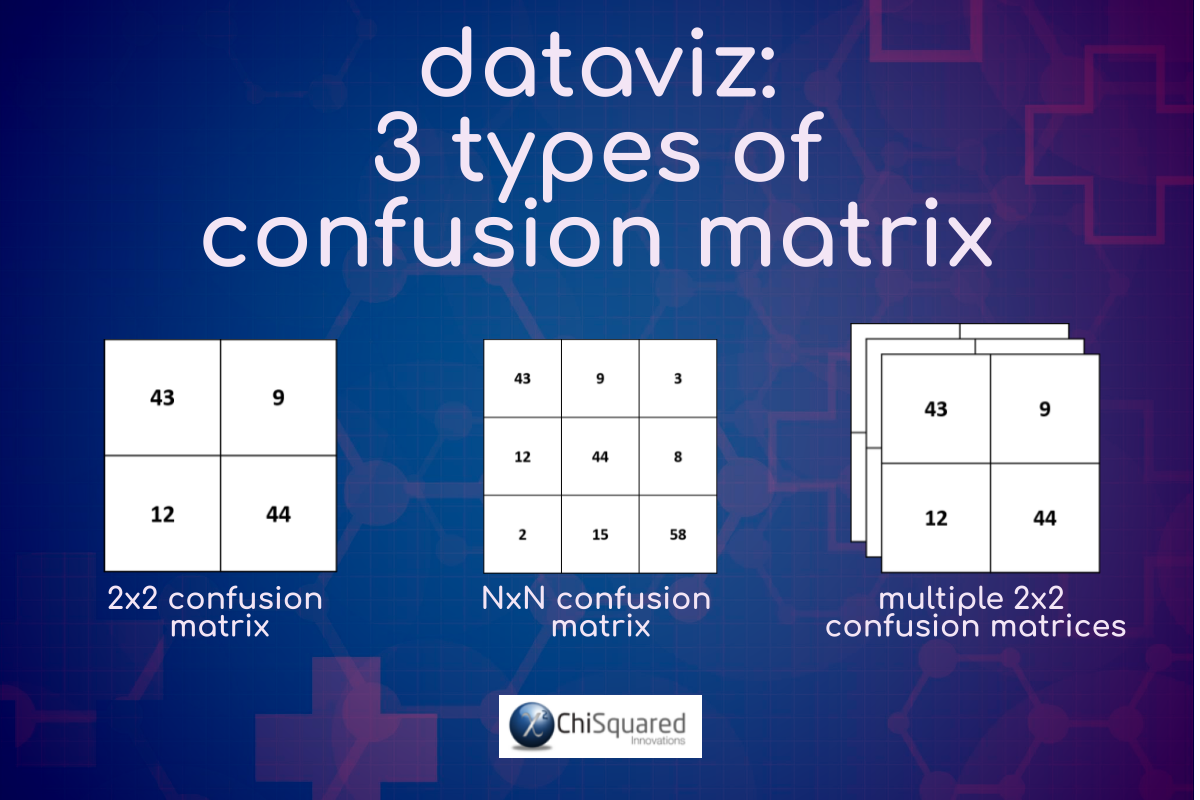
There are 3 types of Confusion Matrix you will come across in statistics:

2x2 Confusion Matrix.
This is the simplest type of Confusion Matrix. It is also the most powerful, as it has a whole branch of statistics dedicated to its analysis. If you have a set of predictions for a categorical variable (for which you also have the actual values) with only 2 categories, and you wish to investigate the effectiveness of your prediction model, the 2x2 Confusion Matrix is how you visualise these data. Results of tests for Accuracy, Sensitivity and Specificity (and lots more test too!) usually accompany any 2x2 Confusion Matrix.

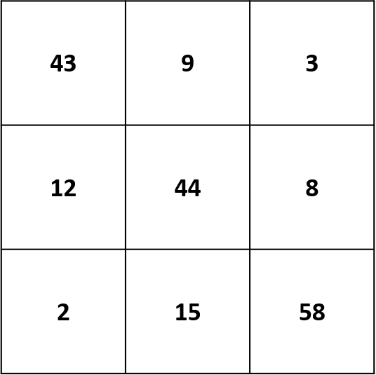
NxN Confusion Matrix.
Confusion Matrix are not restricted to the 2x2 variety – they can come in any size, corresponding to the number of categories of your variable. However, the more categories, the more difficult it becomes to ‘read’ the Confusion Matrix, and the statistical measures are considerably less powerful.

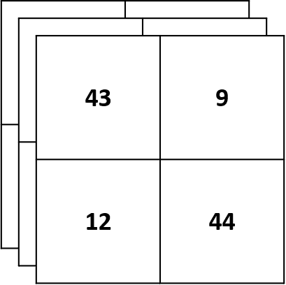
Multiple 2x2 Confusion Matrices.
When you have an NxN Confusion Matrix, you would usually aggregate regions of the table to form Multiple 2x2 Confusion Matrices, each of which is then analysed by the more powerful statistical methods. Bear in mind, though, that for each NxN table, you will get (N-1)x(N-1) new 2x2 Confusion Matrices to analyse! The upside is that if there is a region in the NxN Confusion Matrix that is significantly different from the rest, this methodology will find it.

Confusion Matrix Example
For example, let’s say that you have a quick and easy way of predicting whether a patient is sick with some sort of respiratory virus that just happens to be spreading rapidly across the world. Sounds familiar! It might be a statistical model, a Machine Learning model or something simpler, like a thermometer.
On the other hand, you have a more difficult and time-intensive, but definitive, way of identifying whether a patient is sick, such as a blood test involving a laboratory, expensive equipment and lots of over-worked, underpaid, grumpy staff.
What you want to know is how accurate your predictions are, compared to what you know the actual truth is. If your model is really good, you can make accurate diagnoses quickly, easily and cheaply. This is the Holy Grail of medical diagnosis!
So, what you do is check each prediction from your model against the lab results and tally all the times that your model predicted Sick and was correct, and tally when it predicted Sick and was incorrect. Then do the same for predictions of Not Sick. These tallies form a 2x2 Confusion Matrix, like this:

Confusion Matrix Example – Interpretation
You can make a quick and easy interpretation of a Confusion Matrix by assessing the diagonals. These tell you how often your model was correct (and incorrect – that’s the other diagonal). If the tallies on the ‘correct prediction’ diagonal are much larger than on the ‘incorrect prediction’ diagonal, then your model is likely to be a useful diagnostic tool.
In our Confusion Matrix example above, we can see that the tallies in the ‘correct prediction’ diagonal are much larger than those in the ‘incorrect prediction’ diagonal, so we should be fairly confident in the model.
Just looking at the Confusion Matrix is not enough, though. If you’re going to be absolutely sure that your model is effective (remember that lives are on the line here – there’s a virus sweeping the planet!), you’re going to need to analyse it using various statistical tests.
For those of you that understand how to ‘read’ a Confusion Matrix, the Accuracy of this model is 87%, with a Sensitivity and Specificity of 83% and 91%.
It’s a great model!
FREE DataViz Flowchart

Master the Fundamentals of Data Visualisation
Ultra-Hi-Definition PDF
When To Use a Confusion Matrix
You use a Confusion Matrix when you have a model of some sort (statistical model or Machine Learning model) that is used to make predictions of a categorical variable. The outcomes are classified in rows and columns, where the cells at the intersections indicate how often the prediction matches the actual values.
For example, if you had a facial recognition algorithm that makes a prediction of Gender [Male, Female] from photographs, you would tally all the times that the algorithm correctly predicted Male and do the same for Female. Then you would tally all the times it was incorrect [Male-Female] [Female-Male]. These 4 prediction-outcome pairs would form a 2x2 Confusion Matrix, which could then be analysed to determine how accurate the algorithm is at detecting Gender.
When To Avoid a Confusion Matrix
The Confusion Matrix is a special type of Contingency Table, and it is important to recognise the differences. The Contingency Table is used to describe the relationship between a pair of categorical variables, whereas the Confusion Matrix is used to measure the accuracy of predictions of a single categorical variable. In the Confusion Matrix you have a square array, whereas in the Contingency Table you may have a rectangular array (the number of categories in the 2 variables may not be the same).
It is also important to note that the statistical measures you use in analysing a Confusion Matrix are very different to those used for Contingency Tables.
Confusion Matrix - Best Practice

Pin it for later
Loved it?
Pin it to your favourite board!
The Confusion Matrix – Summary
The Confusion Matrix is probably the most used type of graph in predictive modelling, despite not being very well known outside statistical circles.
Hopefully, you now have a much better understanding of the Confusion Matrix, why they are so important, when to use them, and how to present them to inspire those around you to change the world for the better.
Your DataViz Jump-Station
Looking for your next step?
You can use the following jump-station to choose the content you're looking for:
DataViz Jump-Station
This post is part of a series on the most used graphs in statistics.
For more detail, choose from the options below:
DataViz:
How to Choose The Right Chart for Your Data


