Bar Charts are the less fashionable, younger brother of Column Charts. And whilst they are still among the most used types of graphs in statistics, they are often used incorrectly.
It's not that difficult to get it right, though.
If you want to engage your audience and produce well-crafted charts that have the potential to change the world, there are only a few simple data visualisation best practices that you need to apply to use your Bar Charts correctly.
And they are all here!
Disclosure: we may earn an affiliate commission for purchases you make when using the links to products on this page. As an Amazon Affiliate we earn from qualifying purchases.
In this guide on how to choose the right chart for your data, I’ll explain about the different types of Bar Chart you’ll use.
Then I’ll show you which data goes on which axis (pay attention - this is the really important bit!).
I’ll show you the different types of Bar Charts to use, and how to choose the right chart for your data.
We’ll move on to how to style your Bar Charts and review them with a critical eye to decide what should go on your graph, and – more importantly – what you should take off.
FREE DataViz Flowchart
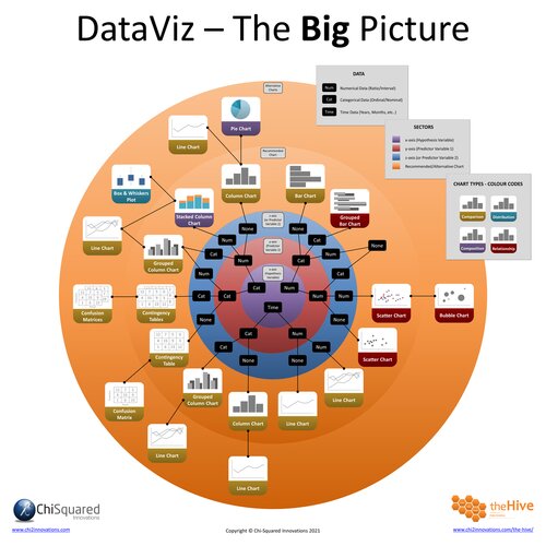
Master the Fundamentals of Data Visualisation
Ultra-Hi-Definition PDF
By the time you’ve read this dataviz guide, you’ll know more about plotting charts than pretty much everyone around you!
Your DataViz Jump-Station
This post is part of a series of articles about the most used types of graphs in statistics for presenting data.
You can use the following jump-station to choose the content you're looking for (and there will be another jump-station at the bottom of this post):
DataViz Jump-Station
This post is part of a series on the most used graphs in statistics.
For more detail, choose from the options below:
DataViz:
How to Choose The Right Chart for Your Data
Bar Chart
What is a Bar Chart?
A Bar Chart is a type of graph that represents categorical data with horizontal rectangular bars, where the lengths of the bars are proportional to the values they represent.
You use Bar Charts when one of your variables is categorical and the other is numerical.
Different types of Bar Chart exist, and for different purposes. We'll delve deeper into this below.
Bar Charts - How to Choose the Right Chart for Your Data @chi2innovations #datavisualization #charts
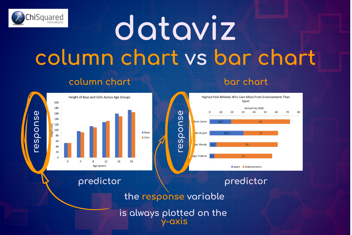
Column Chart vs Bar Chart
Firstly, we need to ask what is the difference between Column Chart vs Bar Chart. Yes, they are different beasts!
A Column Chart has vertical columns, whereas a Bar Chart has horizontal columns.
When should you use a Column Chart?
When your variable of interest is numerical it goes on the y-axis, the categorical variable goes on the x-axis, and you should use a Column Chart.
When should you use a Bar Chart?
When your variables are the other way round and your variable of interest is categorical, your numerical variable goes on the x-axis and categorical variable on the y-axis – you should use a Bar Chart.
What does a Bar Chart show?
A Bar Chart summarises categorical data using horizontal bars to represent the quantities of data for each category. Bar Charts are not usually used to show data changes over time.
VIDEO COURSE
Statistics:
The Big Picture
Free to try - no need to buy or register!
Types of Bar Chart
As with Column Charts, there are 4 main types of Bar Chart you’ll come across in statistics:
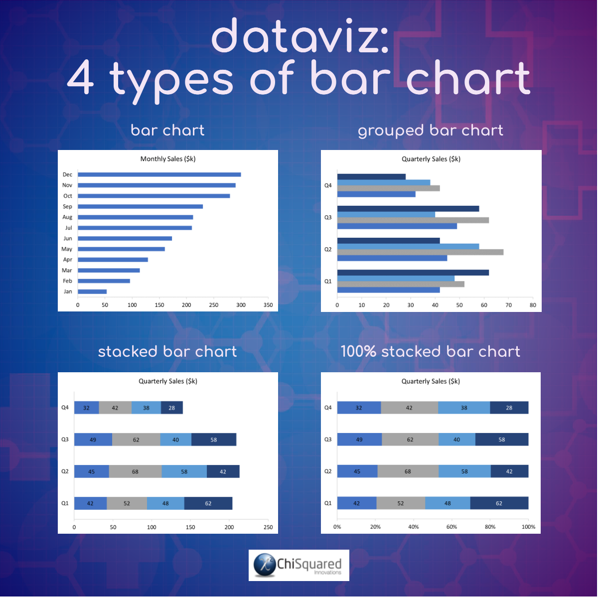
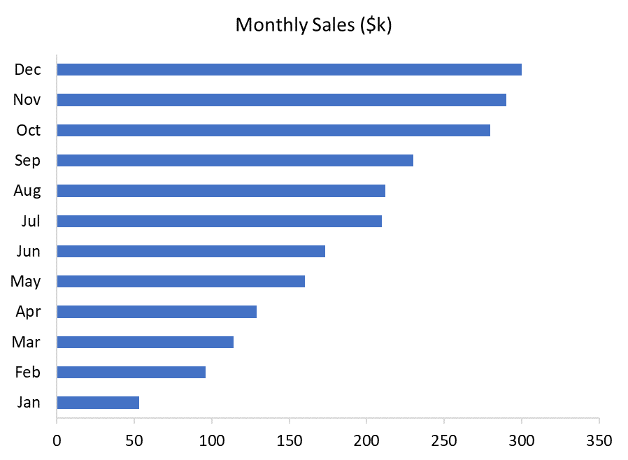
Bar Chart.
This is the simplest type of Bar Chart. It is a single categorical variable on the y-axis, with its corresponding numerical values on the x-axis. Bar Charts are easy to read, and are simple and versatile, but can become cluttered with too many categories.
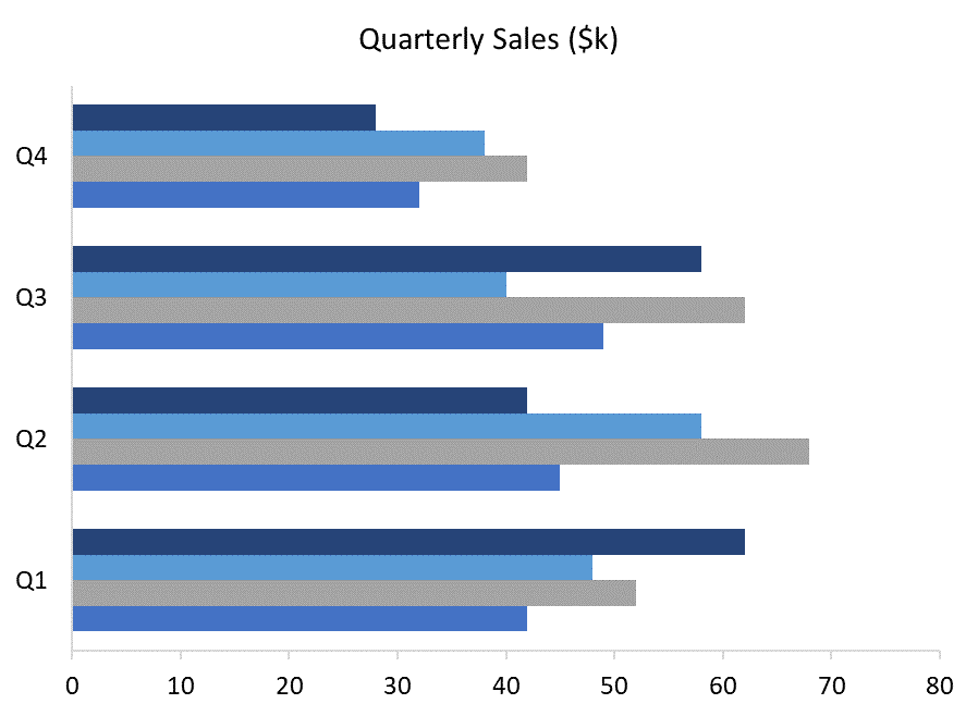
Grouped Bar Chart.
A Grouped Bar Chart (aka a Clustered Bar Chart) is the same as a Bar Chart, but with more than one categorical variable plotted on the y-axis. Grouping bars allows the direct comparison of multiple categories across variables, but can become visually complex as more variables and categories are added.
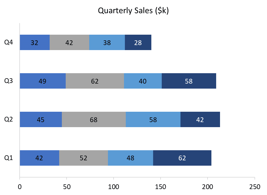
Stacked Bar Chart.
A Stacked Bar Chart is a variant of the Grouped Bar Chart, where data are plotted using horizontal bars stacked from left to right to show part-to-whole comparisons. With Stacked Bar Charts it is easy to compare the total column lengths, but can be difficult to compare the sizes of each component within each bar.
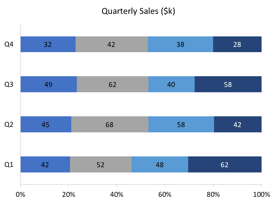
100% Stacked Bar Chart.
A 100% Stacked Bar Chart is useful to show relative percentages of multiple variables in stacked horizontal bars, where the total of stacked bars is always 100%. As with Stacked Bar Charts it is easy to compare the total column lengths, but can be difficult to compare the sizes of each component within each column.
Bar Chart Example
For example, if you want to show a chart of the highest paid athletes who earn more from endorsements than they do from their chosen sport, you could plot them on a Stacked Bar Chart, like this:
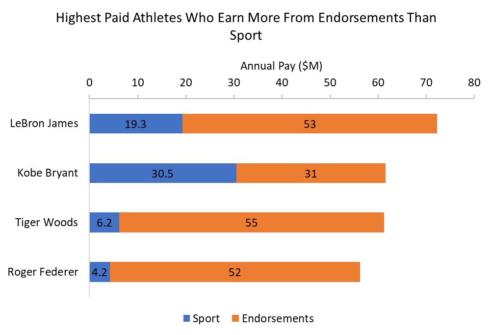
Note that the form of the question asked is important in deciding which type of chart to use. The Bar Chart example above shows us which athletes earned more. The feature of interest is the athletes themselves, not their pay, so the athletes (the categorical variable) are plotted on the y-axis of a Bar Chart. If, on the other hand, you wanted to show how much the top athletes were paid, the feature of interest would be the pay (the numerical variable), so this is plotted on the y-axis of a Column Chart.
Bar Chart Example – Interpretation
As Bar Charts and Column Charts are very similar, the way you interpret them is the same.
In our Bar Chart example above, we can see that LeBron James is the highest paid athlete who earns more from endorsements than sports. Interestingly, though, he is neither the highest paid on this list for sports earnings nor for endorsement earnings. Tiger Woods earns more in endorsements, while Kobe Bryant earns more from sport.
It is also interesting that all of the athletes on this list earn far more from endorsements than from sports, with the exception of Kobe Bryant – his earnings from sport and endorsements are about the same.
If you wanted to show how sport pay and endorsement pay differ in proportions between the athletes, a 100% Stacked Column Chart would be a great chart to use.
FREE DataViz Flowchart

Master the Fundamentals of Data Visualisation
Ultra-Hi-Definition PDF
When To Use a Bar Chart
Bar Charts are best used to compare values for different categories where the categories themselves are the feature of interest, and as such should be plotted on the y-axis.
When To Avoid Bar Charts
Bar Charts work really well when the number of variables and categories are small – when you have too many your charts become cluttered and confusing. Avoid using Bar Charts when the number of categories is larger than 10 (and preferable less than 7 – as few as 5 is perfect), and avoid overloading your charts by restricting the number of variables to no more than 3.
Best Practice for Bar Charts
Whilst it's easy to use Bar Charts incorrectly, it's also easy to use them right, format them well and make your entire presentation an eye-opener for your audience.
And that's exactly what you're looking for.
Hopefully, you now have a much better understanding of Bar Charts, when to use them, what type of chart to use to compare data, and how to present your chart to inspire those around you to change the world for the better.
Pin it for later
Loved it?
Pin it to your favourite board!
Your DataViz Jump-Station
Looking for your next step?
You can use the following jump-station to choose the content you're looking for:
DataViz Jump-Station
This post is part of a series on the most used graphs in statistics.
For more detail, choose from the options below:
DataViz:
How to Choose The Right Chart for Your Data


