Plotting in R can be difficult, but it doesn't have to be. In this blog post I show you the very first steps to plotting in R with confidence - from getting your first plot up and running to getting a multi-panel with no fuss...
For a little while now I've been learning to program in R with a little help from a friend - Matt Dancho - and writing my findings and experiences into a series of blog posts so you can follow along with my progress and maybe try out R for yourself.
This is the fourth post in the series, and in this episode I'm taking my first steps in plotting in R with ggplot.
You don't have to start at the beginning to learn something from this blog post, but if you'd like to, you can find the first post here:
Disclosure: we may earn an affiliate commission for purchases you make when using the links to products on this page. As an Amazon Affiliate we earn from qualifying purchases.
Plotting in R - Catch Up
For reasons I explained at the beginning, I'm using R-Studio Cloud rather than R and R-Studio.
I've installed a collection of R packages designed for Data Science called Tidyverse, imported three data tables and joined them together using Pipes, then wrangled the data to get it into the right format.
In this blog post I'm going to be plotting the data in R with ggplot.
If you're in a hurry and want to learn how to program in R for Data Science in 7 weeks, Matt's course will teach you just how to do that.
And Matt's been kind enough to offer our readers a 15% discount.
Plotting in R - Our Data
So far, I haven't talked about the data that I'm analysing - in previous posts I've tended to give simple examples to illustrate what I'm learning.
If we're going to learn plotting in R I need to explain a little more about the data and what they mean so you can understand the graphs and how I've built them.
Simply, Matt has given us a set of data about sales of bikes. The details aren't important, but it's useful to know that we can group the sales data by year and sum them to give us annual revenue .
Plotting in R - First Steps #datascience #rstats #tidyverse #dataviz @eelrekab @chi2innovations
Plotting in R - Setting Up The Axes
Plotting in R is pretty simple, as you'll soon see, but before you can plot any data you need to build the axes, sort of like setting up a canvas on which you're going to paint your masterpiece.
It's easier than it sounds.
Basically, we need to set up 'aesthetic mappings' in ggplot (which is part of the Tidyverse package we've already installed). These aesthetic mappings describe how our variables are mapped to visual properties (aesthetics) of geometric objects (graphs or geoms).
That sounds complicated, but I only explain this to introduce you to aesthetic mappings (aes) and geometric objects (geom), because then you'll see why we use 'aes' and 'geom' in ggplot.
OK, let's make our first R plot. First, we use ggplot and aes to assign our variables 'year' and 'sales' to the x-axis and y-axis, like this:
myData %>%
ggplot(aes(x = year, y = sales))
And this is what we get out of ggplot:

Although we haven't yet told ggplot how we want to label the axes, it's automatically taken our variable names to be the labels. That's quite useful to start out with. We can change these later (and we will).
Plotting in R - Adding Data to The Axes
No doubt you'll have noticed that ggplot didn't actually plot our data, even though we told it what data to plot.
This is like issuing the command 'jump', to which the obvious retort is 'how shall we jump, sire?' We've told ggplot what data to plot, but we haven't yet told it how we want it plotted - which is what we're going to do next...
We have sales data arranged by year, so the most appropriate R plot here is a histogram, and we're going to use a column chart called 'geom_col' to do it, like this:
myData %>%
previous code +
geom_col(fill = "#007095")
This tells ggplot that we want to plot our data as a column chart, and we want it filled with a specific colour. This is what ggplot gives us:

This is pretty cool - we've only written 2 short lines of R code and already we have a sensible plot.
R has the reputation of having the most advanced graphics packages of all programming languages, and this is why - it is simple to set up and edit. Obviously the more features you want, the more knowledge and experience you're going to need, but to get started and have quick graphics, it's unparalleled.
Plotting in R - Adding Data Labels
As a guy who teaches business analysis in R, Matt's next step is to add data labels to the tops of the Histogram. That's a very businessy thing to do, something that scientists would usually frown upon, but it's useful to know how to do it, so that's what we're going to do next.
So what command do you think you might use to add a label to our geometrical object? (The clue is in the question!).
We use 'geom_label', of course, and since it's an aesthetic feature, we also need to use 'aes' somewhere, and this is how it's done:
myData %>%
previous code +
geom_label(aes(label = sales_text))
Here, the variable 'sales_text' is a copy of the 'sales by year' variable that we previously formatted so that it's in a recognisable dollar format (the details aren't important). I could have just added the sales numbers to the chart, but these look nicer:

The graph is starting to look a little corporate now, which is of course the intention. And there are lots more business-like touches we can add to it...
Plotting in R - Adding a Regression Line
Next we're going to add a linear regression line to the R plot. Obviously we're not going to draw it by hand - it has to be calculated properly so that we can have statistical confidence in it.
Fortunately, there's a function for that, and it's called 'geom_smooth'. We can tell geom_smooth to use a linear model (lm) and that we don't want it to plot the standard error (confidence region), like this:
myData %>%
previous code +
geom_smooth(method = "lm",
color="darkred",
se = FALSE)
And this is what ggplot gives us:

Yes, this R plot looks very corporate - I can imagine the CEO drooling over this...
We're not finished just yet, though, there's still a bit more tidying to do.
Plotting in R - Adjusting The Y-Axis
At the moment, the y-axis is in scientific notation. Just imagine the CEO's reaction when he spots it! We need to fix it, and fast...
To change the y-axis labels from scientific notation to dollar notation we need a little pixie dust magic. We're going to use the function 'scale_y_continuous', and here's where the magic bit comes in.
Let's see the code, and then I'll explain all about the pixie:
myData %>%
previous code +
scale_y_continuous(labels = scales::dollar)
Mostly, the code is self-explanatory: we're going to scale the y-axis with new labels, in dollars. But what the hell is the '::'? A double colon? WTF?!??
This is the magic pixie dust. What we're doing here is using the dollar function to format and display the numbers as dollars. Unfortunately, the dollar function hasn't been installed, so we have to drag it in so we can use it, and that's what the :: does. Personally, I don't understand it, but I don't understand how my PC works either, but that doesn't stop me from using it...
Here's what the R plot looks like:

Ah, that's better. No reason here for the CEO to jump on my head. Now all that's left is to give the graph a title and I can submit my annual report...
Plotting in R - Adding a Title
Just a little more tidying up and we're all done. Here, we're going to use the 'labs' function to add a title and subtitle to the graph, relabel the y-axis and, because it's a bit obvious, we're going to delete the x-axis label:
myData %>%
previous code +
labs(
title = "Revenue by Year",
subtitle = "Upward trend",
x = "",
y = "Revenue"
)
Here's what our final R plot looks like:

And that's job done!
In just a few short steps we've created a beautiful-looking graph that's good enough for an annual report.
And who said that learning R is difficult...
But You're Not Done Yet...
If all you're going to do is plot sales by year, the boss isn't going to be happy. Oh no. Now he'll want you to dig deeper into the numbers. He'll want to see the sales by year for each type of bike that they sell.
So what we need to do here is create a multi-panel plot by using the 'facet_wrap' function.
I'm leaving out the preliminary code (ggplot, geom_col, etc.) because it's very similar to the code from above, but we add one extra line for the facet_wrap function to give us 3 columns of Histograms, like this:
myData %>%
previous code +
facet_wrap(~ category_2, ncol = 3, scales = "free_y")
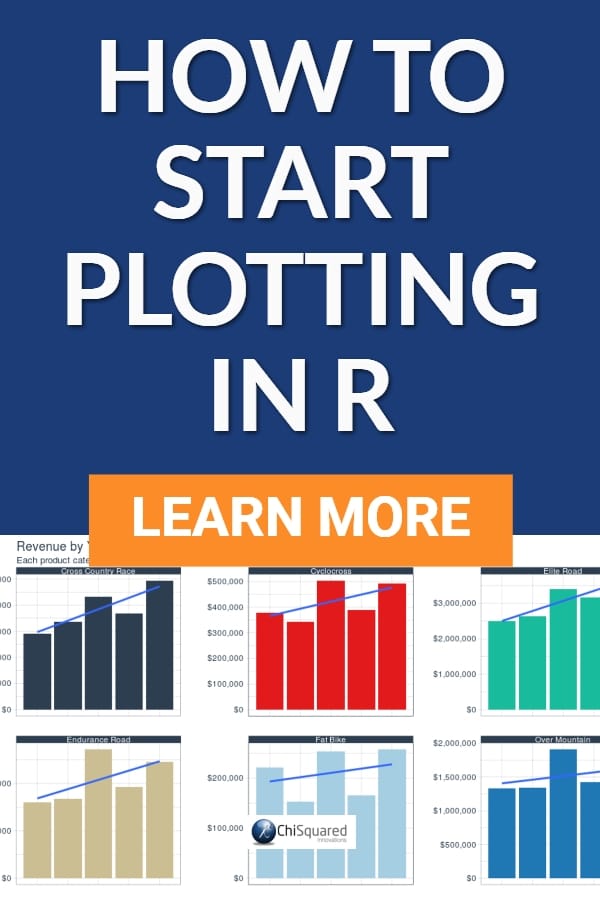
And what we get is a 3*3 plot of Histograms, like this:

And now that's job done!
Boss will definitely be happy with that. You might even get an end of year bonus in your pay packet.
Well, let's not get too excited, though - he still has to buy his mistress that pearl necklace before the end of the fiscal year...
Plotting in R - Summary
R's plotting abilities are unrivalled. This is one of the reasons why it is among the top 2 programming languages in Data Science (Python being the other one), and you can see exactly why in this post.
The syntax for plotting in R is very human-like and readable, and you can get some pretty stunning graphs up and running in just a few lines of code.
It helps when you've got a great teacher too, though...
Thanks Matt!
Check Out The Course
If you're interested in learning R programming for business and follow along with me in this blog series, coding as you go, I highly recommend that you check out Matt's course. It's called Business Analysis With R, and you can check it out below.

with Matt Dancho
All posts in the series:
